Pages

Monday, 30 November 2015

Maya Tutorial | Midday, Sunset and Romantic Lighting

Midday Lighting

Sunset Lighting

Romantic Lighting
 

What If? Metropolis | All buildings with UV


After sorting out the UV layout for each building i ensured that the camera was in the same position as the concept art suggested. The next task for me is to now add another floor then begin painting the in the UV snapshots so that i can apply the textures.

Saturday, 28 November 2015

What If? Metropolis | Modelling and UV progress


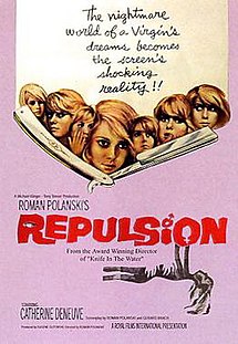
Space Oddities | Film Review | Repulsion

Repulsion (1965 film poster).jpg
Fig 1. Repulsion Film Poster
Roman Polanski's repulsion (1964) is a film deemed to be a psychological horror film in which involves the main character carol who is clearly mentally ill and the deterioration of her sanity and mind is becoming ever greater as the progresses. Her mental state truly comes spiraling down when carol's sister Helen (See Fig 2.) leaves to visit Pisa with her "boyfriend" who is also married to another woman.


Fig 2. Helen Reassuring Carol


Carol fear and eventual mental deterioration comes from the fear of men and their lust that they have for her as Peter Bradshaw explains "her fear of sex develops into a neurotic fascination and horror of dust and dirt of all kinds, a condition that escalates into agoraphobia and paranoid episodes" ( Peter Bradshaw 2013 ). There is many issues that can justify these feelings, for instance each and every man that Carol comes to meet seem to be 'forceful' upon her. The first example would be Colin, who is Carol's admirer and later on breaks her door down to see her, Carol in return kills him with a candle holder. The second example would be the landlord who becomes confrontational about the late rent payments and goes onto attempt to sexually assault Carol until Carol cuts him up with a cutthroat razor. Carol cannot even escape the tight grip of her fears, even in her dreams. As in her dreams she regularly is sexually assaulted by a blacked out figure, this happens about three times throughout the movie. It's really saddening to know that there's a point her mental state is that far gone that there is a scene where she even applies red lipstick to herself before she sleeps, it's almost as if she is preparing herself for the repeating nightmare that she knows she will have. 

repulsion4
Fig 3. Carol's Flat walls beginning to crack and rupture

Through brilliant set design Roman Polanski manages to use the flat as a symbol for Carol ever fading mental state. This begins when Helen leaves home, which backs up the fact that she clearly relies on Helen and cannot cope without her. That's why when she is left for what is in Carol's mind as a long time things that her flat crumbles and breaks much like her mind. "Small cracks in the walls of the apartment flow into crunching indicators of the heroine's crumbling mind" (Bosley Crowther 1965) (See Fig 3), the walls become much like putty, male hand protruding out of the putty like wall trying to grab Carol. At the same time other things are deteriorating/going  to suggest the deterioration of Carol's mind, As Elaine Macintyre iterates "A skinned rabbit from the fridge is left out in the living room to rot and gather flies whilst potatoes sprout eyes in the kitchen* and the bath overflows and floods the floor." (Elaine Macintyre 2014) 
*(See Fig 4)


Fig 4. Rotting Dead Rabbit abandoned by Carol 
It's quite clear that Carol's mind state has not been like this for a small amount of time. This can be suggested from the family photograph which is showed, in this photo it can be seen that Carol is clearly hollow and is only looking directly at a male figure that could be her father or another male family member. This could mean that her fears come from being sexually abused as a child by a male family. Another signifier of this is that in the film it is admitted that Helen and Carol used to live in Belgium, therefore either her parents/family have passed away or they were forced to move away for their own safety. 

Overall it's clear that Roman Polanski's depiction of a frayed and unstable mind of a woman who has intimacy fears is truly brilliant and the use of imagery and subtle symbolism mixes together to make a great feature.

Bibliography 

Bradshaw, P. (2013) Repulsion review. At: http://www.theguardian.com/film/2013/jan/03/repulsion-review. Accessed (27/11/2015)

Crowther, B. (1965) Repulsion. At://www.nytimes.com/movie/review?res=EE05E7DF1739E471BC4C53DFB667838E679EDE Accessed (27/11/2015)

Macintyre, E. (2014) Repulsion. At: http://www.elainemacintyre.net/film_reviews/repulsion.php. Accessed (27/11/2015)

Image Sources 

Figure 1: Repulsion Film Poster (1964) [Poster] At: https://en.wikipedia.org/wiki/Repulsion Accessed (27/11/2015)

Figure 2: Helen Reassuring Carol (1964) [Film Screenshot] At; http://www.flickeringmyth.com/2013/01/roman-polanski-bfi-retrospective.html Accessed (27/11/2015)

Figure 3. Walls cracking in Carol's flat (1964) [Film Screenshot] At: http://psychocinderella.com/2014/08/06/repulsion-review/ Accessed (27/11/2015)

Figure 4. Rotting dead rabbit abandoned by Carol (1964) [Film Screenshot] At: http://horrordigest.blogspot.co.uk/2011/01/repulsion-quiet-perfection.html Accessed (27/11/2015)


Wednesday, 25 November 2015

@phil What If? Metropolis | Re-Imagined Concept Art (Version 2)


What If? Metropolis | Re-Imagined Concept Art


After having a chat with Phil yesterday, i have realized that my city should incorporate a lot more symmetry as Erte works in the style of Art Deco, and with that art style symmetry is a huge part. I feel like this composition is by far the strongest one i have produced yet.

Monday, 23 November 2015

Maya Tutorial | Digital Set | Texturing


Above is my alley scene. I really enjoyed creating this, there wasn't much trouble in terms of creating. But I like the overall outcome.

Sunday, 22 November 2015

What If? Metropolis | Maya Composition Experiments


After receiving my OGR feedback i went onto Maya and created some simple shapes that resembled the buildings that i plan to use for my final concept art.  To give the more 'Human' feel i placed a static camera on the floor of the scene to give that heightened and haughty sense of the buildings. Personally i feel like the second attempt is the strongest.

What If? Metropolis | Orthographic Drawings (Illustrator version)


Saturday, 21 November 2015

Maya Tutorial | Digital Set | Lighting


This tutorial was quite rewarding to finish, as i had a lot of trouble with things going wrong throughout it. The first was installing the mental ray plug-in and the rest was with putting int he point lighting. But in the end i managed to come out with a finished lit up scene. So not all bad.

Friday, 20 November 2015

Animation | Using a Classic Tween | Character Design From Bouncy Ball | Foxes


In Today's lesson we took the character that we made from the bouncing ball animation and changed it's bouncing path using a classic tween. I quite enjoyed going through the tutorials to get to this stage. Although I would still like to go back and potentially make the background better and add some shadows to the foxes.

Thursday, 19 November 2015

Space Oddities | Film Review | Black Narcissus


Fig 1. Alternate Black Narcissus Poster

Black narcissus is a film where through the clever use of set design, lighting and symbolism pushes a very strong message of temptation and giving into it. The film is set within and around the area of a palace that is situated in the right near the Himalayas. It is inhabited by indians, that are dressed up in bright colourings which is apposed to the plain colourings of the Anglican nuns. The Anglican nuns are expected to be able convert the Indian township by changing the palace into a school and also a hospital, the nun who fronts the sisters is Sister Clodagh (Deborah Kerr) who happens to be the one of the youngest sister superiors that is currently working in the order. The other two main characters is Dean and Sister Ruth. Dean (David Farrar) is a local and has been for quite some time, but feels like there is no real way of updating and modernising the way of which the townsfolk live. It's his charms that "trigger a batsqueak of hysteria among the brides of Christ." Sister Ruth (Kathleen Byron) is somewhat strange and as said "emotionally disturbed even before joining the expedition" (MIchael Mirasol 2010) It is when Dean shows kindness to Sister Ruth that she becomes worse than before with refraining from temptation (See Fig.2). This sparks jealously of Sister Clodagh because Dean cares for her more. 

 
Fig 2. A close-up of Sister Ruth, looking sinister and jealous.
Aside from all this acting as temptation it's almost as everything else is putting the nuns on edge with constant hints and symbols based around sex and temptation. One example of this is that the palace used to be a brothel for women to gather in to present themselves for sexual activities with the opposite gender. This of course already shows that the nuns are in a place that once represented forbidden desires. As this quote backs up by saying "All of the time, the building stands ominously on the mountainside, its brothel-house ghosts subtly mocking the chastity of the nuns." (Adam Scovell 2014) There are many more pieces of symbolism and hints throughout the film that still have the same running theme. Examples are the flower that is used, this is because a flower is a symbol for reproduction, because flower "reveal" themselves for pollination. Another symbol used is the bell that is seen to be right between both Sister Clodagh and Sister Ruth which can be seen as the man that separates both sisters. Finally the red lipstick that Sister Ruth applies to herself after she has gone crazy is a massive signifier this is because the use of red lipstick suggest a woman is out for a mate and to break the rules. It's certainly something that a nun would not do. 


Fig 3. View from Bell at palace, with Matte painting underneath

The lighting and cinematography are also things that make this film great. The first great example is that this film isn't even filmed in the Himalayas, it was filmed here in Britain. The way it was done was using brilliant lighting and using great ways of capturing, for example some parts were matte painted to give the illusion of a vast landscape. There's one particular scene where Sister Ruth has finally tried to seduce Dean and during this moment she is lit up with red lighting, by doing this it clearly shows that she is angry/up to no good. (See Fig 4.) 


Fig 4. Sister Ruth when talking to Dean, Red lighting used to set scene
Overall Black narcissus is a brilliant film that manages to constantly reveal underlying issues and symbols through amazing cinematography, lighting, production design and acting

Bibliography

http://www.rogerebert.com/far-flung-correspondents/black-narcissus-which-electrified-scorsese

http://www.theguardian.com/theguardian/2005/aug/05/3

http://celluloidwickerman.com/2014/08/18/the-unleashing-of-repressed-eroticism-in-black-narcissus-1947-and-the-shining-1980/

Image Sources

https://mubi.com/notebook/posts/the-best-of-movie-poster-of-the-day-part-5

http://theredlist.com/wiki-2-20-777-786-view-1940-1950-profile-1947-bblack-narcissus-b.html

http://www.blu-ray.com/movies/Black-Narcissus-Blu-ray/1058/

http://celluloidoptimist.com/black-narcissus/

What If? Metropolis | OGR Part 2


***DIGITAL SET/ MATTE PAINTING SEPERATION***
I have added this outside of the scribe document as i realised i hadn't posted the copy inside. This is essentially the rough breakdown of what will be digital set and what will be matte painting. The top segment is matte painting and the bottom is digital set.


What if? Metropolis | Definitive Influence Map


What If? Metropolis | Orthographs


What If? Metropolis | Final Concept Design


Wednesday, 18 November 2015

What If? Metropolis | Refined House and Palace Thumbnails

With the OGR fast approaching i have decided to collect all my favourite/strongest thumbnails from the experiment that i have been testing and playing with since Monday. This was that with my buildings the women were too obvious and that i should look into filling in the negative space, and find a way to make the buildings curvy. Jordan helped me with some techniques that would help me with my composition and to create some better looking thumbnails. The final concept art is about half way done, now to finish it!

Monday, 16 November 2015

Maya Tutorial | Digital Set | Modelling and UV layout

 View of alley and lamp post after finishing Modelling tutorial 


View of Alley After finishing UV Layout tutorial


Although these sets of tutorials were very time consuming and took a lot of concentration to ensure that everything went according to the videos, i still felt like i enjoyed the process and like the fact that i am able to see that i am now progressing well with these video tutorials.

Sunday, 15 November 2015

What If? Metropolis | House and Palace Thumbnails


With these thumbnails i wanted to use the female figure to act as the main structure holding up the building within. But to adhere to the 'cold' sort of atmosphere that is supposed to be felt within the city i have dimmed down the colors and made them slightly darker. The patterns that i have incorporated into the architecture of the buildings is somewhat minimalist, in the sense that the true extent of the pattern and it's elegance cannot be seen until you are close up to the buildings. I want to explore into smaller looking buildings that will litter around the main 'palace' area, the houses on the other hand i would like to still keep tall and very 'leggy' on the female looking side of the architecture. Next up i will look into tonal range and how my color palette will look and work in my final concept design.

Friday, 13 November 2015

After Effects | Landscape Composition


After having trouble with uploading this last week, I received some help off Simon and now here it is. I quite enjoyed this exercise and loved the final outcome I came out with.

What If? Metropolis | More 3d Thumbnails

With these thumbnails i used the extrusions that i had made on Maya, then duplicated and warped certain parts to fit the shape of an elegant woman. Jordan taught me how to apply patterns with ease, this meant that i could work more in the style of Romain de Tirtoff. I also like the coloring's that i have used with these thumbnails as they aren't too bright and still adhere to the elegantness of my city and the cold mood that is supposed to be felt. 

Thursday, 12 November 2015

Life Drawing | Female Model


I enjoyed this week's life drawing lesson, although my proportions are still somewhat "not there" yet. Therefore in my spare time around my current project i would like to resume doing life model drawing in hopes that my skills become better. Despite this i do still like some of my quick sketches that were done with charcoal, as it was suggested by both Lydia and Vicky that they would certainly be interesting to see put into an animation.