Pages

Sunday, 20 December 2015

Space Oddities | Film Review | The Shining

Fig 1. "The Shining" Film Poster


Stanley Kubrick's "The Shining" (1980) is certainly one of the most iconic horror films that has been created. Kubrick creates atmosphere and a mood of terror and suspense through the use of clever camera play (see fig 2.) and a phenomenal music score; much like Kubrick's 2001: A Space Odyssey where the music plays a huge part of the film. Whereas in "The Shining" the music and supernatural themes used transform characters and settings that would seem rather lackluster into something that has a secret and more depth behind it. Not only is it these things that make for an excellent performance in "The Shining" but also "Kubrick delivers this uncertainty in a film where the actors themselves vibrate with unease" (Roger Ebert 2006) throughout the filming process add to the effect, as one example proves and says: "Nicholson was force fed endless cheese sandwiches (which he loathes) to generate a sense of inner revulsion" (Ian Nathan 2012). 


Fig 2. Danny playing with his cars on the carpet

"Instead of the cramped darkness and panicky quick editing of the standard-issue scary movie, Kubrick gives us the eerie, colossal, brilliantly lit spaces of the Overlook Hotel" (Peter Bradshaw 2012), (See Fig 3.) which is the place that Jack (Jack Nicholson) and his family move to so that Jack can be the caretaker for the winter and try to elevate his novelist career whilst he has a chance to be isolated and quiet. Right near the start of the film it is told to Jack by the hotel manager that the hotel has bared witness to a killing from the previous caretaker where he brutally murdered his wife and two daughters. Despite not being moved or affected by this Jack still decides to go on with taking the job. Maybe there's something underlying that suggests it's impossible for him to resist it? 

Fig 3. The Overlook Hotel


It's clear that right from the get go that the Overlook Hotel is shown as a towering monster that is so large that the character's will go insane from the isolation if not anything else. It also doesn't help when it is subtly announced that the Overlook Hotel is in fact built upon ancient Indian burial grounds and if anyone has seen "Poltergeist" we know this is a sign of bad things are going to happen inside. 
It's Kubrick's imagery and camera use that truly makes the Overlook Hotel seem like it is a beast that consumes victims, the first that sticks out is the large carpet that Danny plays with his toys on, the pattern and angle of the camera shot suggest that he is imprisoned by the carpet and his cars. Another example could be the repeated imagery of the the blood flowing out of the elevator (See Fig 4); this could represent a magnitude of things, but the one that fits the most is that the blood flowing from the elevator is the blood of all the previously slaughtered victims who have stayed at the Overlook Hotel. 

Fig 4. The iconic elevator pouring blood

Originally " The Shining" was existent on it's own as a novel written by Stephen King until Kubrick adapted his writings into a film that unfortunately didn't focus it's themes around the ones that Stephen King had created. This is why Stephen King has openly admitted that he does not like Kubrick's version of "The Shining". Although if Kubrick had adhered to the writings of King more then it is possible that the film could have made a bit more sense to the audience. This is because there is a large sense that Kubrick was unable to decide whether or not "The Shining's" story should be more of a psychological horror or a film that focused mostly on the ghost-side of things. There are many theories behind the characters and their personalities. For instance it is unforeseen as to whether or not Jack (Jack Nicholson) is possessed by whatever lurks inside the overlook hotel, be it a ghost or even a demon, he is mentally insane, he is dead and he is a poltergeist who is looking upon his past or maybe is he just simply hallucinating. Much like Danny (Danny Lloyd) who has hallucinations but instead is supposedly a psychic who is has the gift of "The Shining" meaning he can read people's minds and see the past and future. Some of Danny's "Visions" also seem to have no real relevance to the film, for example the scene where Danny sees the ghosts of two twin girls, alive and dead. 

Overall, it can be said that 'The Shining' is a marvel in the horror film world, but simply has a lot of plot holes. Whether this was intended to be by Kubrick we will never know. 

Bibliography

Quotes
Nathan, I. (2012) The Shining Review At: http://www.empireonline.com/movies/shining-2/review/ Accessed 12/12/2015

Bradshaw, P. (2012) The Shining - Review At: http://www.theguardian.com/film/2012/nov/01/the-shining-review Accessed 12/12/2015

Ebert, R. (2006) Great Movies - The Shining At: http://www.rogerebert.com/reviews/great-movie-the-shining-1980 Accessed 12/12/2015

Images

Figure 1. The Shining film poster (1980) [Poster] At: http://spartanoracle.com/8945/opinions/film-review-the-shining/ Accessed 12/12/2015

Figure 2. Danny playing with cars on the carpet (1980) [Film Screenshot] At:http://betheink.com/2012/12/homage-to-the-shining/ Accessed 12/12/2015

Figure 3. The Overlook Hotel (1980) [Film Screenshot] Athttp://stephenking.wikia.com/wiki/Overlook_Hotel Accessed 12/12/2015

Figure 4. The Elevator pouring blood (1980) [Film Screenshot] At: http://nhpr.org/post/films-greatest-elevator-scenes Accessed 12/12/2015


Wednesday, 9 December 2015

What If? Metropolis | Pre-Final (Only touch-ups left!)


Pretty much finished now! Today will be focused on trying to touch up those last few lines to make it crisper and more graphical. The bump maps are done now and as the advice said, they did help make my scene come to life a lot. Anyway onwards!

Monday, 7 December 2015

What If? Metropolis | Digital Set Progress | Almost Finished Excluding Bump Maps And Final Touch-Ups


What If? Metropolis | Digital Set Progress | Testing Matte Paintings and Finalizing Set


At the moment I have still to do some extra things on my Maya scene to start to finalize everything. First of all, I need to dim down the reflectivity on the pathway as it has too much of a watery effect. I need to re size the texture of the pathway as it doesn't fit the rest of the scene as it's too big. I still need to crisp up the lines for the front buildings, change the intensity of the spotlights pointing on the main tower as they are making it look 'milky' and lastly I would like to add area lights behind the front buildings to pick out the edges around it a bit more.

Sunday, 6 December 2015

Animation | Gestures | Basketball


What If? Metropolis | Digital Set Progress Update


After playing about with textures for a while in Maya I have managed to churn out this so far. It's not really anywhere close to a finished product yet, i am still yet to add more spotlights and a few more lights around the main building. I would also like to make the textures on the buildings at the front that bit more crisper and add a bit more depth by looking at some stone patterns and try to hand paint them into the colours that are already there. Also everything texture wise still feels flat, that could probably do with some looking at...

Thursday, 3 December 2015

What If? Metropolis | Further progress | Stairs and Path


After spending a bit of time adding and walkway leading up to the front entrance of the i thought that it would be best to add the last parts that need to be modeled. Therefore i added in a pathway as well. The first part of texturing has been completed also, this is on the stairs. This is where i have applying a black texture with hints of white and on top of that i have applied a slight shine to the stairs to relect the lights applied.

Life Drawing | Alan | 2/12/15


Tuesday, 1 December 2015

What If? Metropolis | Digital Set Progress


On the previous post I had already UVed my buildings and figured out the camera position. But after playing about with Maya I have added a large amount of glowing bulbs to the buildings in the places that were shown on my concept art, I have incorporated stair to each building as it was pretty clear that there was no way of gaining access to the buildings. I have also added some spotlights to the floor which will have a spotlight on Maya in each of them, each of these will have the light fog effect, so that they look like how they should on my concept art. There is only a few more little things that I need to add to the scene i.e a path and some stairs on the priestess building, other than that i'm completely ready for texturing.

Monday, 30 November 2015

Maya Tutorial | Midday, Sunset and Romantic Lighting

Midday Lighting

Sunset Lighting

Romantic Lighting
 

What If? Metropolis | All buildings with UV


After sorting out the UV layout for each building i ensured that the camera was in the same position as the concept art suggested. The next task for me is to now add another floor then begin painting the in the UV snapshots so that i can apply the textures.

Saturday, 28 November 2015

What If? Metropolis | Modelling and UV progress


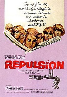
Space Oddities | Film Review | Repulsion

Repulsion (1965 film poster).jpg
Fig 1. Repulsion Film Poster
Roman Polanski's repulsion (1964) is a film deemed to be a psychological horror film in which involves the main character carol who is clearly mentally ill and the deterioration of her sanity and mind is becoming ever greater as the progresses. Her mental state truly comes spiraling down when carol's sister Helen (See Fig 2.) leaves to visit Pisa with her "boyfriend" who is also married to another woman.


Fig 2. Helen Reassuring Carol


Carol fear and eventual mental deterioration comes from the fear of men and their lust that they have for her as Peter Bradshaw explains "her fear of sex develops into a neurotic fascination and horror of dust and dirt of all kinds, a condition that escalates into agoraphobia and paranoid episodes" ( Peter Bradshaw 2013 ). There is many issues that can justify these feelings, for instance each and every man that Carol comes to meet seem to be 'forceful' upon her. The first example would be Colin, who is Carol's admirer and later on breaks her door down to see her, Carol in return kills him with a candle holder. The second example would be the landlord who becomes confrontational about the late rent payments and goes onto attempt to sexually assault Carol until Carol cuts him up with a cutthroat razor. Carol cannot even escape the tight grip of her fears, even in her dreams. As in her dreams she regularly is sexually assaulted by a blacked out figure, this happens about three times throughout the movie. It's really saddening to know that there's a point her mental state is that far gone that there is a scene where she even applies red lipstick to herself before she sleeps, it's almost as if she is preparing herself for the repeating nightmare that she knows she will have. 

repulsion4
Fig 3. Carol's Flat walls beginning to crack and rupture

Through brilliant set design Roman Polanski manages to use the flat as a symbol for Carol ever fading mental state. This begins when Helen leaves home, which backs up the fact that she clearly relies on Helen and cannot cope without her. That's why when she is left for what is in Carol's mind as a long time things that her flat crumbles and breaks much like her mind. "Small cracks in the walls of the apartment flow into crunching indicators of the heroine's crumbling mind" (Bosley Crowther 1965) (See Fig 3), the walls become much like putty, male hand protruding out of the putty like wall trying to grab Carol. At the same time other things are deteriorating/going  to suggest the deterioration of Carol's mind, As Elaine Macintyre iterates "A skinned rabbit from the fridge is left out in the living room to rot and gather flies whilst potatoes sprout eyes in the kitchen* and the bath overflows and floods the floor." (Elaine Macintyre 2014) 
*(See Fig 4)


Fig 4. Rotting Dead Rabbit abandoned by Carol 
It's quite clear that Carol's mind state has not been like this for a small amount of time. This can be suggested from the family photograph which is showed, in this photo it can be seen that Carol is clearly hollow and is only looking directly at a male figure that could be her father or another male family member. This could mean that her fears come from being sexually abused as a child by a male family. Another signifier of this is that in the film it is admitted that Helen and Carol used to live in Belgium, therefore either her parents/family have passed away or they were forced to move away for their own safety. 

Overall it's clear that Roman Polanski's depiction of a frayed and unstable mind of a woman who has intimacy fears is truly brilliant and the use of imagery and subtle symbolism mixes together to make a great feature.

Bibliography 

Bradshaw, P. (2013) Repulsion review. At: http://www.theguardian.com/film/2013/jan/03/repulsion-review. Accessed (27/11/2015)

Crowther, B. (1965) Repulsion. At://www.nytimes.com/movie/review?res=EE05E7DF1739E471BC4C53DFB667838E679EDE Accessed (27/11/2015)

Macintyre, E. (2014) Repulsion. At: http://www.elainemacintyre.net/film_reviews/repulsion.php. Accessed (27/11/2015)

Image Sources 

Figure 1: Repulsion Film Poster (1964) [Poster] At: https://en.wikipedia.org/wiki/Repulsion Accessed (27/11/2015)

Figure 2: Helen Reassuring Carol (1964) [Film Screenshot] At; http://www.flickeringmyth.com/2013/01/roman-polanski-bfi-retrospective.html Accessed (27/11/2015)

Figure 3. Walls cracking in Carol's flat (1964) [Film Screenshot] At: http://psychocinderella.com/2014/08/06/repulsion-review/ Accessed (27/11/2015)

Figure 4. Rotting dead rabbit abandoned by Carol (1964) [Film Screenshot] At: http://horrordigest.blogspot.co.uk/2011/01/repulsion-quiet-perfection.html Accessed (27/11/2015)


Wednesday, 25 November 2015

@phil What If? Metropolis | Re-Imagined Concept Art (Version 2)


What If? Metropolis | Re-Imagined Concept Art


After having a chat with Phil yesterday, i have realized that my city should incorporate a lot more symmetry as Erte works in the style of Art Deco, and with that art style symmetry is a huge part. I feel like this composition is by far the strongest one i have produced yet.